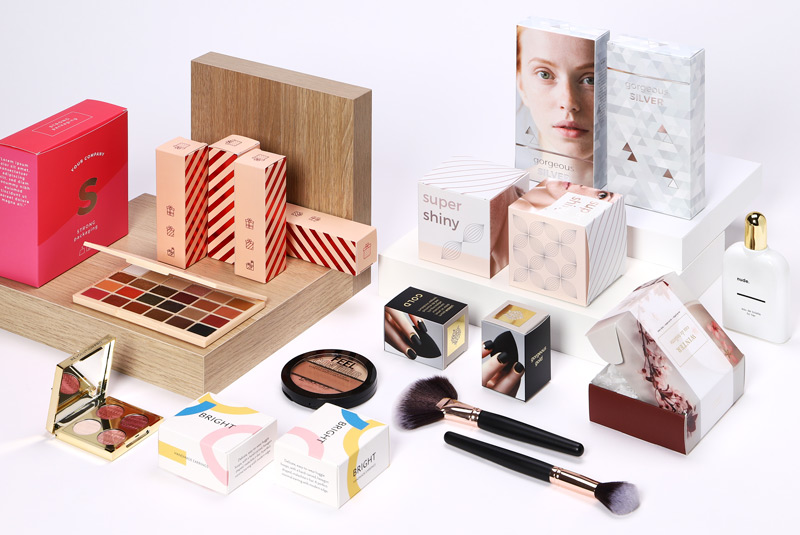
Color plays a crucial role in the world of cosmetic packaging. It influences customer perception, evokes emotions, and ultimately impacts purchasing decisions. Understanding the psychology behind colors can help beauty brands create packaging that resonates with their target audience. At ThePackagingTree, we specialize in designing visually appealing and strategically colored Cosmetic Packaging to enhance brand identity and customer engagement.
The Influence of Colors on Consumer Behavior
Every color carries a psychological impact, triggering subconscious associations and emotions. In the beauty industry, brands leverage these effects to establish a unique identity and appeal to specific demographics. Below are some key color associations in cosmetic packaging:
1. Pink – Feminine and Playful
Pink is often associated with femininity, romance, and softness. It is widely used in cosmetic packaging targeted toward younger audiences or products that emphasize beauty, delicacy, and skincare.
2. Black – Elegance and Luxury
Black exudes sophistication, elegance, and mystery. Many high-end beauty brands use black packaging to convey exclusivity and luxury, making it a popular choice for premium cosmetic lines.
3. White – Simplicity and Purity
White represents cleanliness, simplicity, and purity. Skincare and minimalist beauty brands often use white packaging to highlight natural ingredients and a sense of freshness.
4. Gold and Silver – Prestige and Glamour
Metallic colors like gold and silver are commonly used to signify wealth, luxury, and exclusivity. These colors are particularly effective for high-end beauty products, making them feel more premium and desirable.
5. Green – Natural and Sustainable
Green is associated with nature, health, and eco-friendliness. Brands that emphasize organic ingredients, sustainability, and environmental consciousness often opt for green tones in their packaging.
6. Red – Passion and Boldness
Red is a powerful color that evokes energy, passion, and confidence. It is frequently used in makeup packaging, particularly for bold lipsticks and nail polishes, to create an intense and captivating appeal.
7. Blue – Trust and Serenity
Blue conveys calmness, reliability, and professionalism. Skincare and anti-aging brands often use blue to suggest trustworthiness and soothing effects, making it an ideal choice for serums and creams.
Choosing the Right Color for Your Brand
Selecting the perfect color scheme for your cosmetic packaging depends on your brand’s identity, target audience, and the message you want to convey.
At ThePackagingTree, we understand the importance of color psychology in packaging design. Our team specializes in creating custom cosmetic packaging that aligns with your brand’s vision while ensuring strong market appeal. Whether you aim for a minimalist, luxurious, or eco-friendly look, we provide tailored solutions to make your brand stand out.
Conclusion
Colors play a fundamental role in shaping consumer perception and influencing purchasing behavior. By strategically choosing the right color palette, beauty brands can enhance their packaging aesthetics, strengthen brand identity, and connect emotionally with their customers.
Partner with ThePackagingTree to create custom cosmetic packaging that not only looks stunning but also drives consumer engagement and brand loyalty.


Leave a Reply